![]()
Nintendo Research
The history of nintendo dates back all the way to 1889. Nintendo was originally called “Nintendo Koppai” and was a small business in kyoto that produced Hanafuda Cards. The company was founded by Fusajiro Yamauchi. The Hanafuda Cards were playing cards that were used to play multiple card games, these cards were handmade and they quickly gained popularity.
At the age of 70 Fusajiro retired and gave the business to his adopted son-in-law Sekiryo Kaneda (who changed his name to Sekiryo Yamauchi) in 1929. After the continued running of the company as the largest card manufacturer, Sekiryo decided to expand the company and start a joint venture, which renamed the company Yamauchi Nintendo & Company in 1933, and created a card game distributor called Marufuku Company Ltd. Both companies grew their business into corporate giants. After running the company for 20 years, Sekiryo had a stroke in 1949, which forced him to retire. Sekiryo had Hiroshi Yamauchi, who was in law school at the time, take over the company.
Hiroshi had a difficult time becoming the new president of Yamauchi Nintendo & Company. He had to drop-out of school at the age of 21 to take over the family business. His inexperience in the family business caused resentment among the company’s employees, which was followed by a factory strike. Hiroshi surprised everyone by firing every employee who went against him and established new policies that made it a requirement for all potential products and ventures to be cleared by him alone. He then changed the name of the company to Nintendo Karuta and then to Nintendo Company Ltd.
In 1953, Hiroshi Yamauchi, became the first to produce plastic playing cards in japan. This proved to be very popular and allowed Nintendo to dominate the industry. After a trip to the US in 1956, Hiroshi decided to rethink the long term viability of the playing card business. He went on to visit the country’s largest card manufacturer and was surprised by the small offices they had. He arrived at the conclusion that the playing card industry was too limited.
In 1959, Nintendo made a deal with Disney to have Disney’s characters printed on their cards. This allowed the business to expand into an entirely new market. Up until this point, playing cards were seen as a device exclusive to gambling. Now that Nintendo has a new, younger audience, Nintendo created guidebooks that explained how to play all the new games that can be played with the cards. This deal was very successful and sold over 600,000 packs in the first year. After this success, the company decided to go public in 1962.
When Nintendo went public, they ventured into taxi service, hotels and the food industry, which was all unsuccessful.
In 1972 the US military test project, the Brown Box project became available to the American public as the first video game console. This console was called the Magnavox Odyssey. In 1975, Nintendo acquired Odyssey’s distribution rights for Japan, which had moderate success. From this success Nintendo started to develop their own games and console with the Color TV Game system.
In the 80’s, Nintendo’s business grew both domestically and internationally. Business grew to the point where they could open offices in their second largest market, the United States, they called it Nintendo of America (NOA).
After seeing the success of a console system with interchangeable cartridges, Nintendo decided to develop their first multi-cartridge gaming system in 1983. This was the 8-bit Famicom, which provided near-arcade quality games with more power and memory storage than any previous console on the market.
At first this game console had poor results in japan, until Shigeru Miyamoto produced a game taking Mario Bros into a new style of multi-level adventure Super Mario Bros. This game was a huge success, so Nintendo decided to bundle the game with the Famicom system, which improved sales as consumers would buy the bundle just to play the game.
Then, in 1985, Nintendo announced the world wide release of the Famicom, but with a few changes, which included altering the design of the console and name was changed to Nintendo Entertainment System. To help prevent another market crash, Nintendo limited the number of games that third party developers could release each year.
Over the following decades, Nintendo released home and handheld consoles.
Audience Analysis
Game content with scenes or sounds that can possibly frightening to younger children should fall in this category. Very mild forms of violence (implied, non-detailed, or non-realistic violence) are acceptable for a game with a PEGI 7 rating.
The client had requested for a product created which would be aimed towards 5 to 10 year olds, to make a child friendly game similar to Nintendo’s Mario.
We expect the audience to be at a working class for low income families with interest to Nintendo games hence the game being affordable, to appeal towards higher and middle class families by including downloadable content that gives more content after the ending of the games narrative to tie loose ends or questions that may pop up.
The consumer has an understanding of Nintendo game conventions, such as the stereotypes in characters. For instance, in the successful Nintendo franchise Mario, Mario is the protagonist and Princess Peach is the rewards/goal of the main story and the main antagonist is Bowser with a simple narrative structure that children could follow. However, due to it being a platform game most of the gameplay is puzzle solving and can be educational and alongside a surreal aesthetic and atmosphere making the mild violence very childish.
The product is very family friendly and aimed at a working class with no biases to gender. Aiming towards families with low income hence the product being affordable and worth hours of gameplay instead of a heavy narrative, similar to Mario it involves puzzles and a surreal world. Families with interest of a games that are puzzles and races will definitely enjoy the product. To ensure the product stays within the intended demographic it will not include any graphical contents such as; drugs, alcohol, violence, gambling, fears, sex and bad language. However due to bright vibrant colours it would not be friendly towards people that suffer from epilepsy.
Our primary audience being children would enjoy the product as we will include vibrant colours and a simple game mechanic with a straightforward tutorial. Additionally, a character customization for a role playing game element and allows consumers to express themselves in their way through the character’s appearance. The mixture of so many genres would be engaging and fun for the audience and will attract a large variety of audiences with interests of; RPG (Role playing game), racing, platform, and open world games.
Our team will advertise the product via the internet with splash art and concept art because of a rise of internet activity by children it will attract them more as it will be on most social medias like Facebook, Instagram, twitter and Tumblr.
The client expects a non-violent game aimed towards children. Therefore, the product will be family friendly and very surreal to keep the consumer engaged and a puzzle feature for more hours of fun.
Retro gaming: a brief history
The first video games appeared during the 1960’s and has since seen a sales increase with a variety of different arcade, home and handheld consoles. In July 1983, Nintendo released the 8-bit console, Nintendo Entertainment System (NES). This console was developed mainly for home gamers instead of arcades. The console had a global sale of 61.9 million.
Six years later, in April 1989, Nintendo released the 8-bit handheld console ‘Game Boy’, which they solely developed and manufactured. The Game Boy had a global sale of 118.69 million. In December 1994, Sony decided to release their own video game console, it was called the PlayStation 1, it was to compete with Nintendo and Sega. The PlayStation 1 had a sale of 102.49 million.
The successor to the Game Boy was the Game Boy Colour, which was released nine years after the Game Boy’s release. This console had a sale of 118.69 million because of the colour and the longer features. In March 2000, Sony released their new console, the PlayStation 2, which was the first console to have backwards compatibility with PlayStation 1 games and controllers. The PlayStation 2 had a sale of 155 million.
In November 2006, Nintendo released their seventh generation console, the Nintendo Wii, which had a sale of 101.63 million
What does the future of retro gaming look like?
Gaming has changed a lot since the release of the original Nintendo Entertainment System, but with the increasing demand for retro consoles, the video game market seems to be going back to its roots, with Nintendo planning to release the Nintendo 64 Classic mini follow the success of the NES Classic Mini.
In the meantime, Nintendo released the Super Nintendo Entertainment System Mini Classic in September. It has the original look and feel of the 90’s version, only smaller and it also has 21 games. Atari will also make a comeback in 2018 with their release of the Atari Box, which will have both retro games and modern games.
In 2018, Nintendo will release the C64 Mini, which will be equipped with high definition output via HDMI, a classic style joystick and 64 games.
Stephanie Staszko said: “There’s been a lot of push for a Spyro remake following the success of the Crash Bandicoot remake. I wouldn’t be surprised to see some arcade classic revamped for VR either. People want a mix of sparkly new technology and the familiar, pixelated faces of the characters from their childhood.”
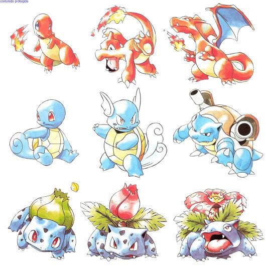
Pokémon was created by Satoshi Tajiri, who at first enjoyed collecting insects as a child, then he found the Game Boy and Game Boy Game Link Cable, he thought of insects traveling along the wire, moving with the cable. He also played a game called Ultra Seven, which had a main character that used small capsules to contain monsters that they could use to fight. These are the concepts that gave Satoshi the idea to make a game called ‘Capsule Monsters’, which was the beginning for the development of Pokémon.
After several attempts, Satoshi finally convinced Nintendo to fund his project for Pokémon, but due to trade market issues, he had to change the name to ‘Pocket Monsters. The original artwork for ‘Pocket Monsters’ was done by Satoshi’s friend Ken Sugimori, and the music and sound effects were done by Junichi Masuda. This project nearly pulled Satoshi’s studio ‘Game Freak’ into bankruptcy, Satoshi had to work unpaid a lot of the time.
The first Pokémon game, Pokémon Red and Green, was released on the Game Boy in Japan on February 27th, 1996. The first game had 151 Pokémon, the game allowed players to catch, train and trade Pokémon, so they could become a Pokémon master. The game started with decent sales, but when an event cantered around the Legendary Pokémon, Mew started, sales for the game increased significantly. In response to this increase in sales, Pokémon Blue was released with better game play.
After the release of these games, a Pokémon Trading Card Game was debuted on October 20th,1996 with 102 cards. The card game was inspired by the video games and had illustrations from the original artist.
Since the games were popular, an anime series was premiered in Japan on April 1st, 1997. The main character of the anime series is Ash Ketchum, he was based on Red, with Gary Oak, his rival, being based on Blue. The anime series became really popular, so a lot of manga series followed. The most popular Pokémon manga series was Pokémon Adventure.
On April 25th, 1998, the first Pokémon Centre store was opened in Tokyo, this store sold Pokémon merchandise. Currently there is six different stores throughout japan and a small one in a Nintendo store in New York.
Since the franchise was so successful in Japan, the franchise was released overseas. The localization team in America tried to change the designs of the Pokémon because believed the cute factor wouldn’t attract western gamers, but their proposal was refused. The anime and Pokémon Red and Blue were released in North America in September 1998.
The success of the anime continued, so the first Pokémon movie, Mew two Strikes Back was released in theatres. In the United states, for a short period, the movie held the record for the highest grossing opening for an animated movie. Due to the success of the anime, Pokémon Yellow was released, which allowed player to play as Ash Ketchum and travel through the Kanto region alongside Pikachu. This was start of how Pikachu became the most popular Pokémon and become the franchises mascot.
The initial 151 Pokémon were joined many other Pokémon in 1999, following the release of Pokémon Gold and Silver in Japan for the Game Boy Colour. In these games, the story was set in the Johto region and more than 100 new Pokémon were introduced. These games also introduced new features, such as breeding, time-based events and shiny Pokémon variants. These games were released in North America in 2000. The anime series followed the game by introducing the Johto region along with all the new Pokémon, the Trading Card Game did the same. The third version of the Pokémon games was then released, it was called Pokémon Crystal, this version allowed players to choose the gender of their trainers for the first time and the Pokémon were finally given their own animations.
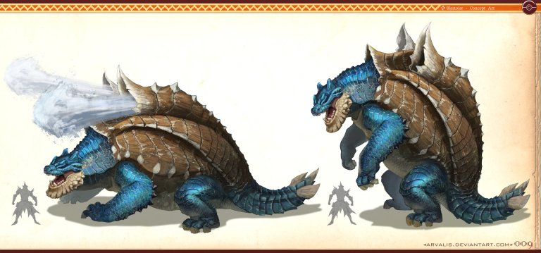
A mixture of a monster hunter turtle and Pokémon’s’ blastoise which present a terrifying blue turtle with the ability to shoot high pressure water out of its shell which can be lethal. The detail added into the scales of both skin and shell is immaculate though can be petrifying for a three-year-old child hence the products design being more cartoon style. The sharp edges make the creature all the more menacing but it is contrasted by the colour blue being used as it can be seen as a friendly or melancholy cold colour. The style of the background is similar to a scroll however the right hand sign is what is seen within the pokedex which is a mobile gadget used to keep track of Pokémon’s seen or collected throughout the game. Although the scroll gives it an ancient vibe, almost as if it were an extinct creature that was documented within the early ages of the 18th century. The creatures facial expression is as if it were about to feast on something or to bite something, with its sharp tail it has a very violent appearance that would not be suitable for the intended or targeted audience.
RJ Palmer is a professional concept artist at Ubisoft in San Francisco, United States of America. His work on Art station is mostly creatures from Pokémon with a realistic alteration which makes these simple cartoon designs more terrifying. It has a similar appearance of a dinosaur or a medieval dragon both known for the calamity and destruction it can cause due their large size. Palmer’s works are mostly concept art which is his profession and the work he posted stayed consistent in style and detail.
Similarly, this artist from Art Station also made a Pokémon model however this artist also printed it out in 3D. This Pokémon is well known due to the animation of the franchise being dedicated to it for decades as it is adorable and the franchises poster boy. This artist edited Pikachu with a Frisbee in its mouth to capture the likeness of Pokémon’s and pets such as dogs. Although RJ Palmer’s was realistic, this design is more suited for our target audience as the designing is not deemed threatening or terrifying. With the primary colour of Pikachu being yellow it instantly is a positive trait on the creature though the humanisation of Pikachu is increased with some of the fur being flicked upwards to imitate hair close to that of a child. The artist shows their progression and many failed attempts showing dedication and that being a perfectionist will help with improving diligence towards small errors and helps quick thinking and problem solving.
Chenuka Ratwatte is an amateur artist with really detailed work however most of the work is based on fictional characters from existing medias like a painting of Moira from Over watch but his style has progressed from last year as Chenuka has recently modelled Tom Holland from Spiderman Homecoming though his work is heavily inspired by pre-existing shows or movies it will be similar to our product which is heavily influenced by pre-existing Nintendo franchises.
Ken Sugimori
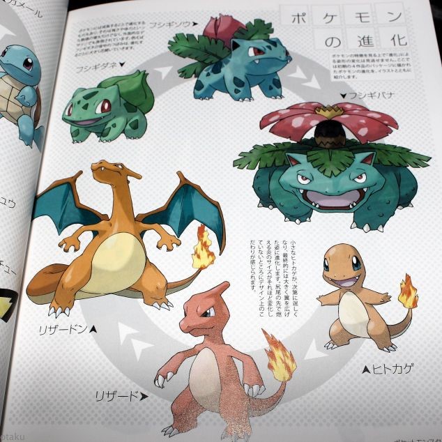
Ken Sugimori is the original Pokémon designer, he has works dating back to 1996, where Pokémon was first created and designed.
Ken Sugimori is a 52-year-old Japanese artist, born in 1966, well known for his final and set designs for the original 151 Pokémon. Ken used to illustrate a gaming magazine made by Game Freak, which was made by his friend Satoshi Tajiri who would become the creator of Pokémon, which in course began to develop arcade games and kept reworking until they weren’t just a magazine anymore. Ever since then, Sugimori has worked on numerous other Pokémon features like movies, cards, games and other collectibles.
Sugimori has said that some of his inspiration for the newer games comes from analysing animals in aquariums and zoos and is always looking for new ways to surprise the players when he is asked to create new creatures.
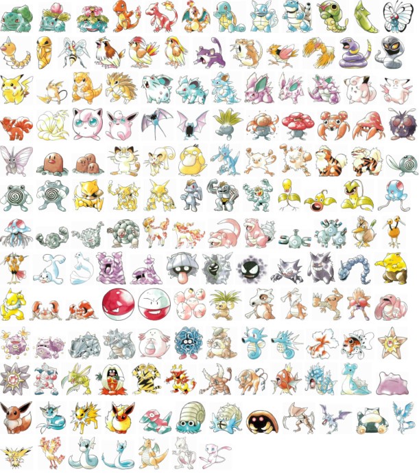
all 151 original Pokémon (1996)

100 Pokémon later released by Sugimori in 2000
Sugimori has led new designers of Pokémon in their aid to create new creatures as the series goes along, keeping his signature colouring-air bushy style along with it, keeping sort of a nostalgic feel to them, especially to older audiences of Pokémon.
Sugimori’s new and cleaner style of official Pokémon he had created
It has also shown that his art has improved dramatically over the years, as his old style featured an airbrush-like colouring, and now it is much cleaner and detailed. Showing more of the Pokémon’s design and anatomy. Sugimori has been successful in hundreds of Pokémon in his time of working in the franchise, and will continue to make more.
All of Suigmori’s Pokémon up till the 2013 games, Pokémon Y and X.
Artist Research- Collin Geller
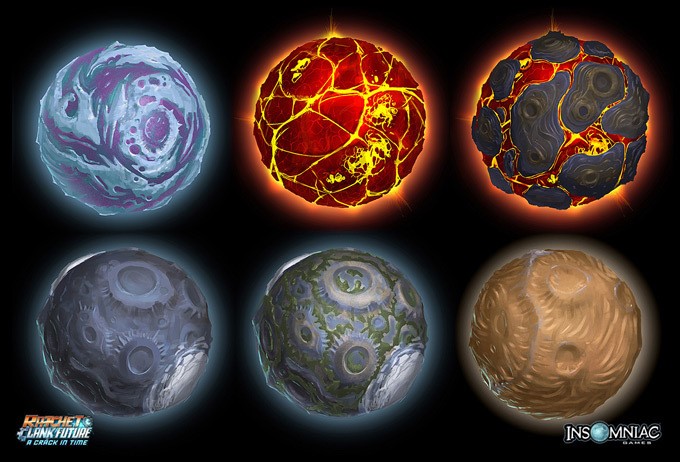
Planets for Ratchet and Clank: A crack in time (2009)
Colin Geller is a concept artist based in Dallas, USA. He works on many well-known games such as Wolfenstein, DOOM, Overstrike and Ratchet and Clank. This portfolio of games show how varied Geller’s skills are, as DOOM is a rather realistic game in terms of graphics, while Ratchet and Clank are rather cartoony.
Colin has worked for many different companies, such as Trion Worlds, Magic Pixel Games, Insomniac Games and now currently works for iD Software on titles such as DOOM, Wolfenstein and Quake since 2013. He has been a professional concept artist since 2009.
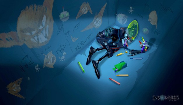
Official art of Ratchet and Clank : A crack in the time (2009)
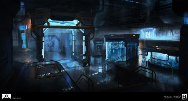
Concept art for a battle room in DOOM (2016)
If someone were to compare these two art pieces, you can see that the art style is very different, showing that Geller has skill in a majority of art style, something that is very helpful for a concept artist to have. Geller has experience dealing with different genre and types of games, as games such as Wolfenstein are quite obviously different compared to the Ratchet and Clank franchise.
Visual Analysis
Since the brief specified that we are working for Nintendo the chosen inspiration will be previous works of Nintendo. The game covers for Nintendo 3DS Pokémon are quite consistent through the current years from 2013 to 2018 with a legendary Pokémon that you encounter at the end of the narrative being the main focus for their targeted consumers. Due to Pokémon being a globally famous franchise their cartoonish art style is very recognisable and have many copies such as Digimon which have a similar premise of wild surreal monsters coexisting with humans and have become an integral part of society.
The colour scheme of this particular Pokémon has a cold palette because the legendary Pokémon on the cover is an ice type, different types of Pokémon helps exploit weaknesses and show their strengths such as fire being stronger than grass type. A simple game strategy for those whom are 7 and above can follow as it involves mild violence which will not be included into our product to ensure more variety of audiences. The use of contrasting colours connotes violence supported by the Pokémon’s posture and body language being ready for battle. The PEGI symbol of a fist means that it includes violence however with the main demographic being children and students it is a mild violence and mostly adventuring an open world although some places are restricted due to the narrative not being complete.
The layout of the game case is a very minimally filled cover. With the PEGI is aged 7 or above although it can achieve a 7 plus rating from bad language, with the cover being minimal and containing a background of outer space it supports a surrealism to the game, and a Nintendo approved seal in the back to ensure consumers that the company worked hard to create an immersive gameplay similar to their other well-known franchises such as Mario.
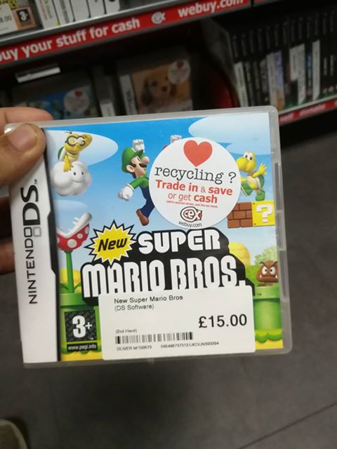
Mario is a 2D sliding platform game but over the years has now infused 3D within the gameplay. Though the sticker from CEX may be covering mario, this game was made as a cooperative and team puzzle solving game and the obstacles and mini bosses make the game engaging and fun for younger audiences. The cover of this case shows a simple light blue gradient sky with calm clouds alongside a turtle wearing goggles and riding a sentient cloud is looking towards the protagonists. The design of most characters within the image are smiling apart from the giant snappy flower and the grumpy brown mushroom giving the atmosphere a bright happy theme which is supported by the bright vibrant colour palette with yellow standing out and the brothers (main protagonists) both hop in sync and cheerfully. As the obstacles are the turtles, flowers and grumpy mushrooms its concept is completely surreal and the solution to turtles and grumpy mushroom is to jump on top of them which would make the turtle hide in its shell and just flatten the mushroom, which is not violent as they are not slain but simply knocked out or scared however the flower is just a timed trap which can be avoided by jumping or eliminated by throwing a fireball onto it. Now the theme is very surreal and imaginative which is inspiring our product to go for a surreal theme and the colour scheme to be bright with a warm or happy palette of colours. The 2D aspect will be included within the product as the team would be more comfortable with a 2D style rather than a 3D and can make a better product that can follow the conventions of a 3 plus age rated Nintendo game.
The cover consists of what the player will encounter which will not be incorporated in our product cover as less is more. For example, in the Pokémon covers which entices the audience to read the plot behind the cover and thus the images of gameplay content may intrigue the consumer enough to purchase it.
The rule of thirds is primarily focused on the title of the game due to the franchise being globally famous as well but the addition of “New” will attract previous consumers as it offers new content and a more innovative version of the product.
This franchise has influenced our product because of it being one of Nintendo’s biggest successes.
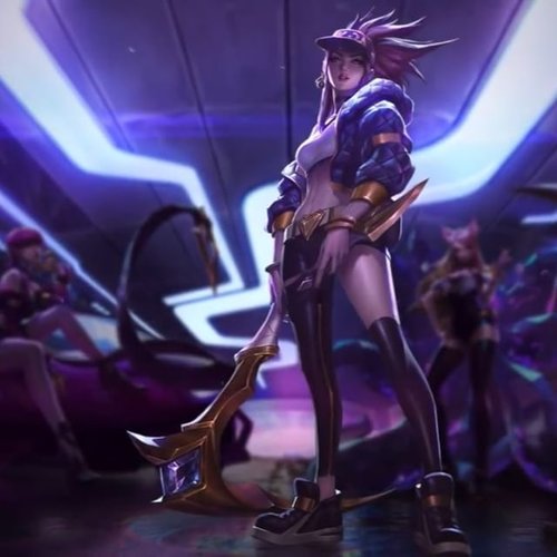
A team of professional illustrators created this splash art, having it focused on a single character whilst the others are blurred alongside the rule of thirds to have the audience to be intrigued by the small details added to the character’s costume. This collaborated work is the kind of quality we aspire to achieve, using a body language that embodies the character’s persona. The focused character is shown through a low angle shot which empowers her stance, with the addition of her wielding weapons it adds a menacing tone and an urban theme garage which is confirmed by the blurred Lamborghini that is sat on by one of the blurred characters in the background. The characters are from a Riot Game referred to as League of Legends, a popular online moba game. The art style is far from the graphics of gameplay but depicts a cinematic detail that the illustrators exaggerate through lighting, with the lights being dim and a gradient reinforcing a cinematic atmosphere. The image is heavily urban and modern which can be seen by their clothes, the neon light and the spray cans lying on the floor near the Lamborghini. The character is primarily purple, white and gold all of which are rich colours however the urban theme alters it towards a modern rap setting similar to the setting in the end of 8 Mile.
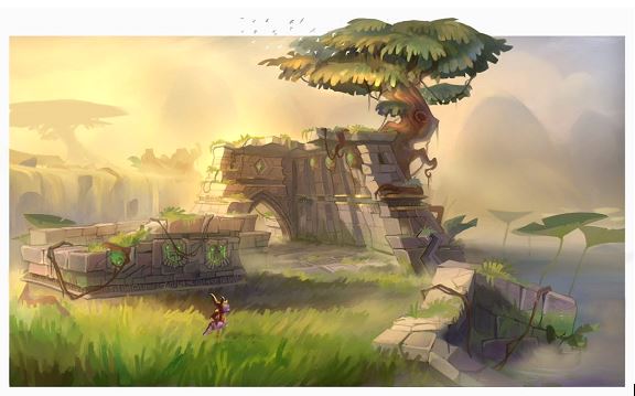
I used the recently revamped ‘Spyro’ game concept art because it is the art style we are looking for in this assignment, it is not too realistic yet not too cartoony.
The composition of this chosen drawing is very well done, there are no clumped areas nor are there any plain and neglected areas, perhaps the top right corner need a bit more items happening. There is no sort of object which seems out of place and it seems to all be in one theme.
The colours blend well together, they are vibrant yet not too vibrant to clash or become an eyesore for the consumer’s eyes. The colours and shading make the drawing look aesthetic to the eye, it also sticks to being somewhat realistic and strays from any lighting that may not make sense
There are lots of textures shown in this concept art, the way the artist painted the stones made them look cracked and rugged, implying that they were man-made ruins and they are rough to the touch. The grass is done in a way that it looks almost fluffy to touch, and the tree’s trunk looks solid, all in all the textures are well done and do their duty of showing what they’re made of and what they might feel like.
The size differences between objects helps create an atmosphere, the way the ruins were drawn makes the character seem so small and helps set the environment, the ruins help show what was there before and can give the consumer an idea of what once was there.
Bibliography
Andrew Cartledge. (2018). The Retro Gaming Revival (Case Study). Available: https://www.mobiles.co.uk/blog/retro-gaming-revival/. Last Accessed 29th Nov 2018
Chen, B. (2015). Bo Chen. Available: https://www.artstation.com/chenbo. Last accessed 25th Nov 2018.
D.S. Cohen. (2018). The History of Nintendo Video Games. Available: https://www.lifewire.com/history-of-nintendo-729734. Last accessed 25th Nov 2013.
Geller, Collin. (2012). Collin Geller. Available: http://conceptartworld.com/wp-content/uploads/2012/05/Colin_Geller_15a./jpg. Last accessed 03/12/18.
Geller, Collin. (2016). DOOM, first battle. Available: https://www.artstation.com/artwork/vRxJE. Last accessed 03/12/18.
Heathman, A. (2018). Spyro Reignited Trilogy: Toys for Bob on bringing Spyro back to life. Available: https://www.standard.co.uk/tech/spyro-reignited-trilogy-toys-for-bob-interview-a3995331.html. Last accessed 26th Nov 2018.
Kevin. (2016). Art of Colin Geller. Available: http://escapethelevel.com/art/art-colin-geller-151/. Last accessed 03/12/18.
Kholer, Chris. (2018). How Yoshi’s island got it’s hand drawn style from. Available: https://kotaku.com/how-yoshi-s-island-got-its-beautiful-hand-drawn-look-1826849563. Last accessed 29/11/18.
Lee, A. (2010). Bio – Alvin Lee. Available: https://www.alvinleeart.com/about/. Last accessed 25th Nov 2018.
Miranda Madden. (2016). THE HISTORY OF POKÉMON. Available: https://www.history.ca/history-topics/latest/the-history-of-pokemon/. Last accessed 1st Dec 2018.
Palmer, RJ. (2). Pokemonster Hunter-Blastoise. Available: https://www.artstation.com/artwork/nJvW6. Last accessed 24th Nov 2018.
Pan, C. (2014). Chengwei Pan. Available: https://www.artstation.com/pan. Last accessed 25th Nov 2018
Parentzone. (2018). PEGI games ratings explained. Available: https://parentzone.org.uk/article/pegi-games-ratings-explained. Last accessed 24th Nov 2018.
PEGI. (2017). What do the labels mean? Available: https://pegi.info/what-do-the-labels-mean. Last accessed 24th Nov 2018.
Ratwatte, C. (2017). Pikachu with lollipop project 3D model and 3D printed. Available: https://www.artstation.com/artwork/eW3L6. Last accessed 24th Nov 2018.
Stuart, K. (2010). Super Mario Bros: 25 Mario facts for the 25th anniversary. Available: https://www.theguardian.com/technology/gamesblog/2010/sep/13/games-gameculture. Last accessed 24th Nov 2018.
Sugimori, Ken. (1996). Illustrations. Available: https://lh3.googleusercontent.com/-y1FNzScfVUI/UMpXdxQx8cI/AAAAAAAABSs/ghRY6HvkdV8/s530-p/ilustraciones%2Bde%2B1996.j.pg. Last accessed 29/11/18.
Sugimori, Ken. (2014). Ken Sugimori Works. Available: https://otaku.co.uk/files/images/fullsize/89069Z10.JP-G. Last accessed 29/11/18.
Sugimori, Ken. (2017). Johto Pokemon. Available: https://www.deviantart.com/jurassicworldfan/art/All-Johto-Pokemon-Ken-Sugimori-Artwork-696366509. Last accessed 29/11/18.
SYH. (2017). UI Breakdown: Pokemon Sun. Available: https://medium.com/the-space-ape-games-experience/ui-breakdown-pokemon-sun-moon-87c5fd7d3370. Last accessed 26th Nov 2018.
Tech Terms. (2018). GUI. Available: https://techterms.com/definition/gui. Last accessed 26th Nov 2018.
TEGAN JONES. (2013). The Surprisingly Long History of Nintendo. Available: https://gizmodo.com/the-surprisingly-long-history-of-nintendo-1354286257. Last accessed 25th Nov 2013
Upclosed. (2018). Ken Sugimori. Available: https://upclosed.com/people/ken-sugimori/. Last accessed 29/11/18.
Wallace, Mitch. (29th Oct 2018). Spyro reignited concept art revealed.Available: https://www.forbes.com/sites/mitchwallace/2018/10/29/new-spyro-reignited-trilogy-screenshots-and-concept-art-revealed/#2c70ae31b9a8. Last accessed 23/11/18.
Ward, V. (2013). Children using internet from age of three, study finds. Available: https://www.telegraph.co.uk/technology/internet/10029180/Children-using-internet-from-age-of-three-study-finds.html. Last accessed 24th Nov 2018.
| Image 1
|
Image 2
|
Image 3
|
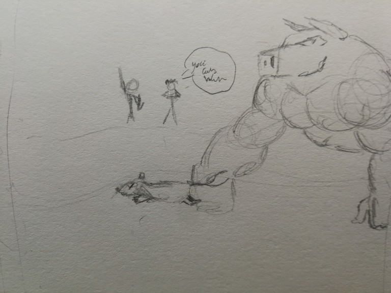
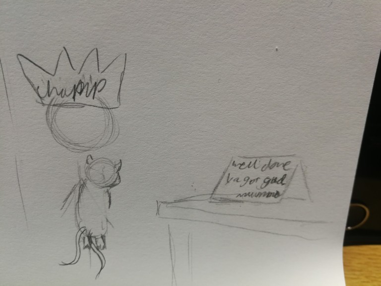
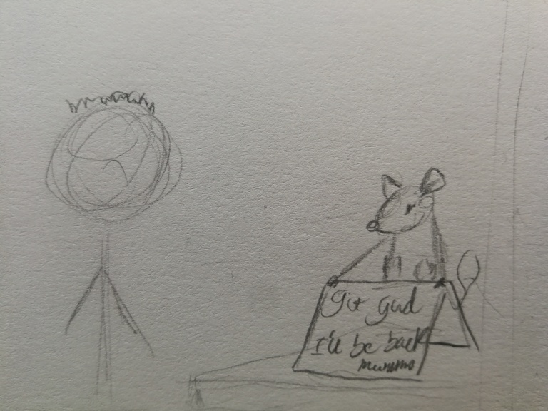
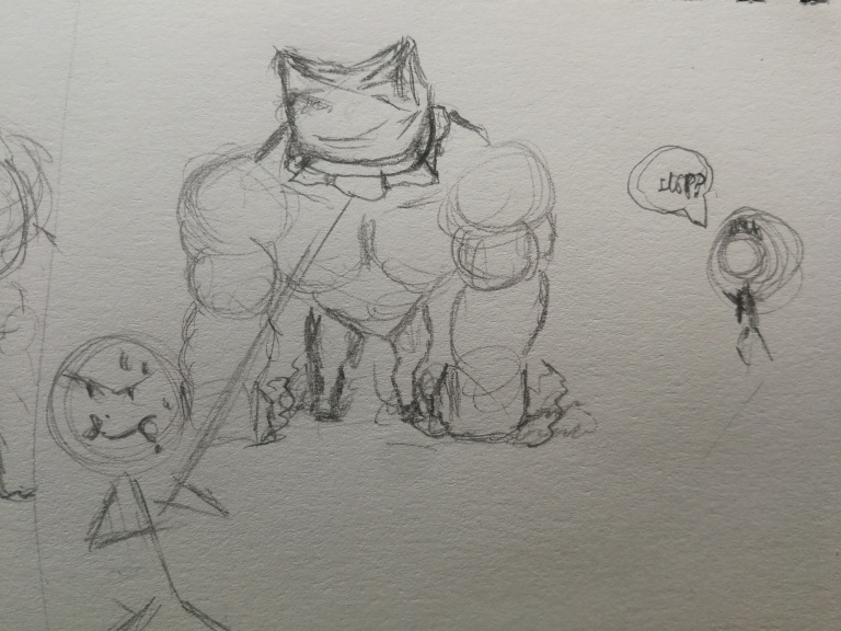
| Interior, Day: Protagonist finds a letter on a table from his mother explaining her absence with encouraging words. The protagonist was left three different monsters to choose from by the protagonist mother. |
Exterior, Day: Protagonist decides embarks on an adventure to become the very best monster racer after defeating a self proclaimed rival. He jumped triumphantly on a field. | Exterior, Afternoon: Troubled kid taking monsters from racers. Protagonist intervenes. |
| Image 4
|
Image 5
|
Image 6
|
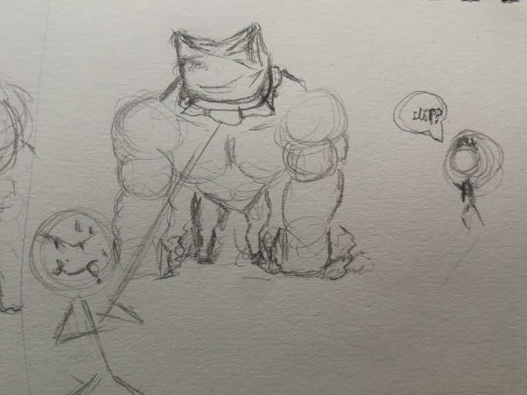
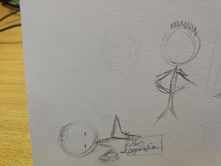
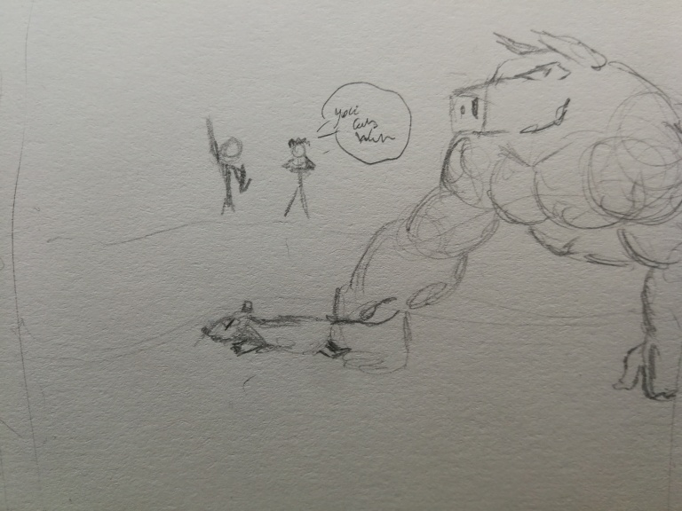
| Exterior, Afternoon: Protagonist races against troubled kid and won easily. The troubled kid afterwards calls for help from an organisation. | Exterior Afternoon: An organisation goon appeared and was beaten by the protagonist. The organisation went into hiding. | Interior, Evening: Protagonist finds letter from mother saying that she is proud after the protagonist won and became the best. |
Todorov Theory Narrative Structure:
Equilibrium: Protagonist wakes up in their room then finds a letter from their mother. Protagonist is told to choose his very own monster
Disruption: Protagonist races with the monster for the very first time and wins.
Recognition of disruption: Protagonist sees a troubled kid attempting to steal a monster from its owner. Which the protagonist then challenges and defeats with ease.
Attempts to repair disruption: The troubled kid then calls for help from an organisation, within a few minutes one of the organisation goons show up to challenge the protagonist but is also beaten.
New Equilibrium: The protagonist then embarked on an adventure to protect the monsters and win the competition to get their mothers approval.
Initial Designs:
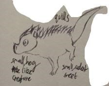
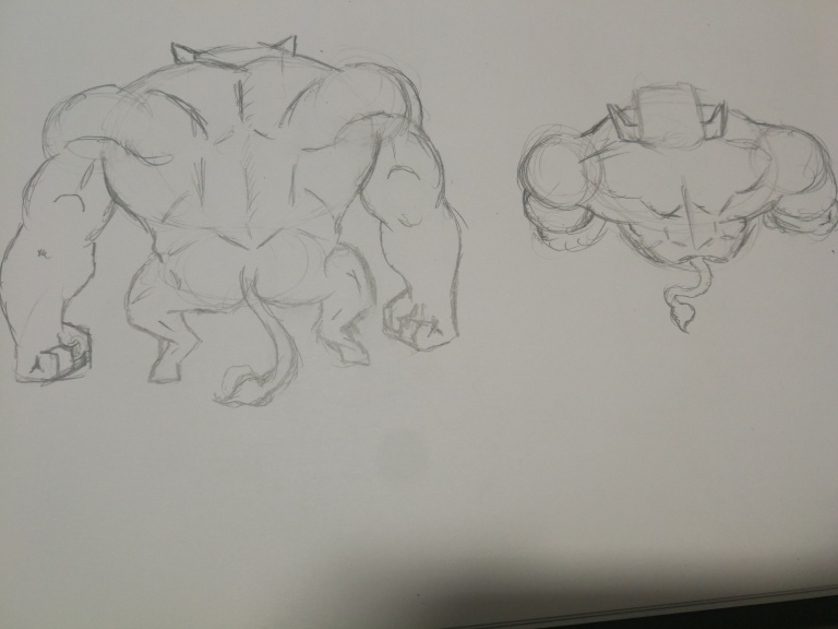
Small creature with the featuristics of a hog but adding quills and minimizing the feet to be different and have a cartoonish style.
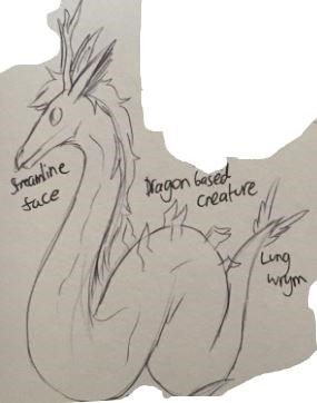
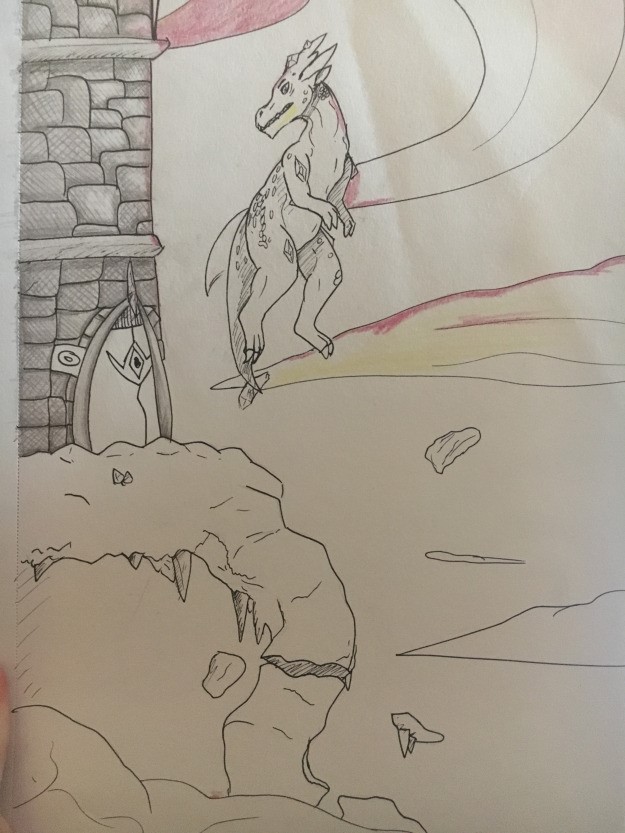
A dragon based creature
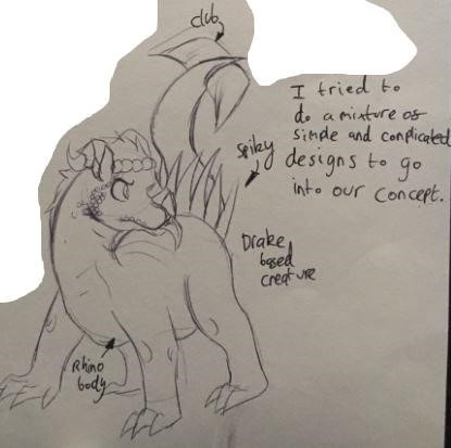
I tried to do a mixture of complicated and simple features to go into the concept. Similar to a drake and a dragon with a rhinoceros body with a club on the end of the tail.
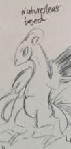
Nature/Leaf based creature with a young dragons features such as small claws and wings.
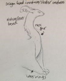
Another dragon based creature, with moss fur as it is a nature/ leaf based creature.
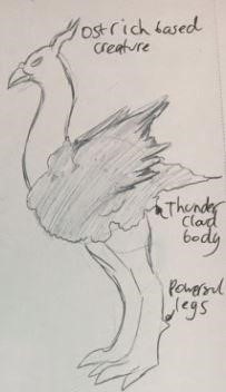
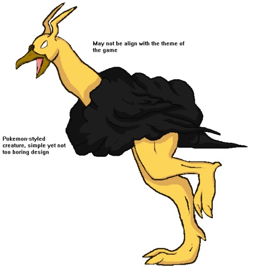
Ostrich based creature, a thundercloud body that powers the legs.
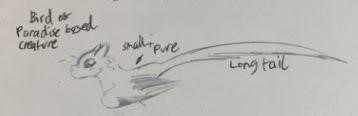
Bird or paradise based creature due to it resembling majestic creatures like a pegasus. Small with a pure nature and a long tail to navigate flying.
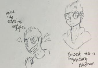
Anime style characters.
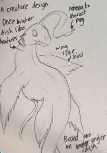
A seafish like creature, wing like fins based of an angler fish.
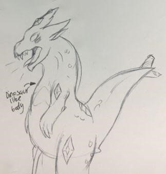
Dinosaur like body.
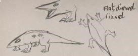
Flat diamond lizard creature.
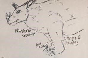
Rhinoceros creature, large and stocky with huge claws.
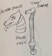
Horse face cane creature with a haunted magic.
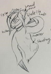
Humanoid face, blade like hands with a button mouth. Wearing a sweater with a haunting nature due to it resembling a human.
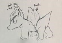
A lava hair with a rock on its back similar to a turtle.
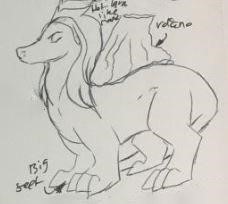
A volcano on its back and a lava mane, the feet got bigger.
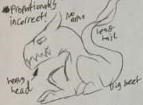
No arms, heavy head, big feet and a leaf tail.
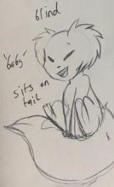
Blind, baby and sits on its tail.
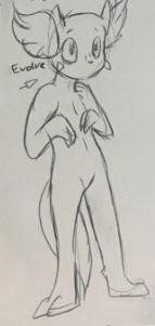
Can see and stands on its feet kind of like a human.
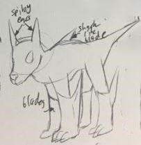
Spiky ears, blades on its legs. Has a sharp blade on its back. Dog like creature.
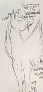
Ostrich like creatures with tusks and long legs.
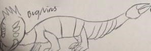
Bug virus, centipede like creature.
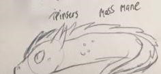
Moss mane and eel like body.
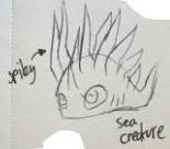
Spiky sea creature.
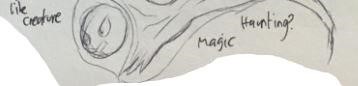
Ghost creature, magic and haunted.
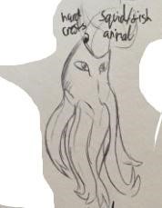
Squid like creature.
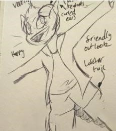
Friendly outlook, happy, lobster tail.
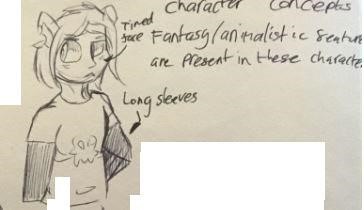
Timid face, wearing long sleeves.
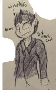
No pupil, wearing a trench coat.
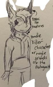
Fox features, wearing hoodie. A background character.
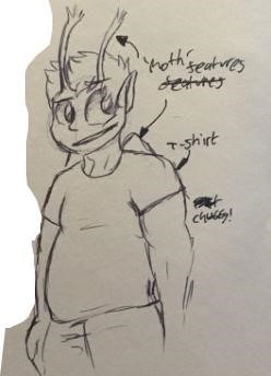
Moth features, wearing a T shirt and a background character.
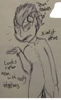
Horn on its head, menacing intentions from their body language. Scientist attire.
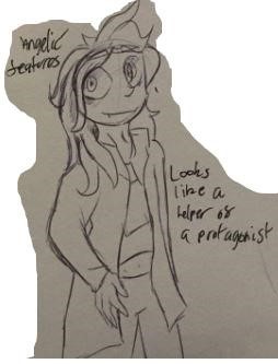
Majestic features, looks like a helper of the protagonist.
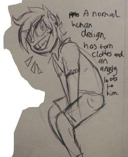
A normal human design, wearing torn clothes and angry look.
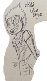
Chibi style characters for children.
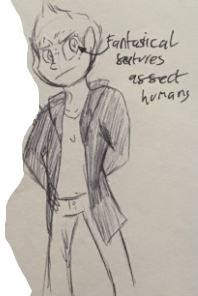
Fantastical features.
Background initial designs :
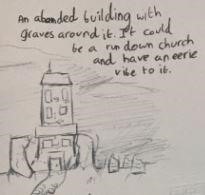
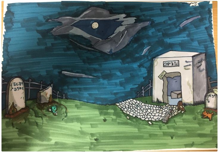
An abandoned building with graves around it. It could be a random church and have an eerie vibe to it.
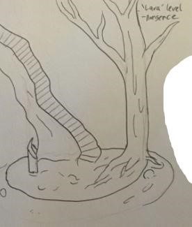
Lava level with a tree that will never burn.
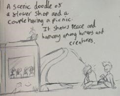
A scenic concept of a shop and a couple having a picnic, it shows peace and harmony amongst humans and creatures.
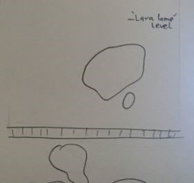
Birds eye view of the lava level.
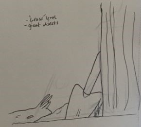
Grass level contains giant insects.
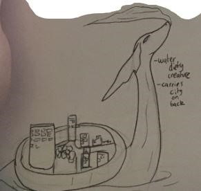
Water deity creature carrying a city on its back.
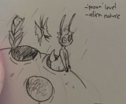
Moon level with an alien nature.
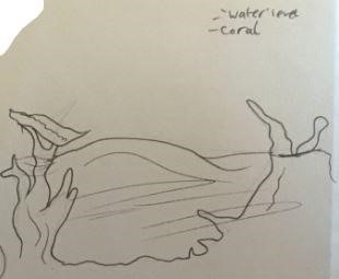
Water level, coral.
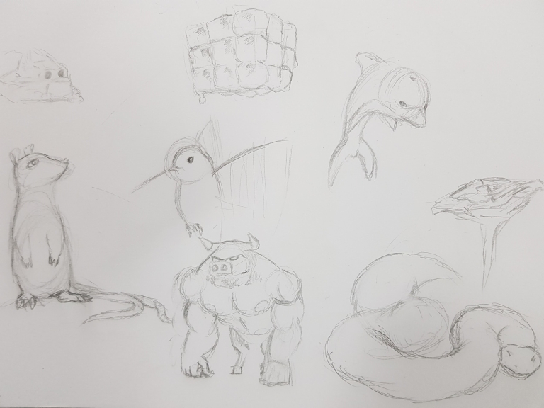
Top left: this is just a rock with holes for eyes. Its face is snow plough-shaped to dig through the earth but if i were to develop this I would try to give it other features to make it seem more like a living organism rather than just a moving rock.
Top center: It is a sentient cube of ice made of smaller cubes of sentient ice. I do think the design is the most original of them all but I do not think I could do anything more with the design without completely changing it.
Top right: A dolphin. I think the dolphin itself is an interesting idea; I could make it seem less realistic and more cartoonish to make it fit more with the aesthetic of the game.
Bottom left:.I drew a rat with two tails.
Center: This is a hummingbird. Like the dolphin i could make the art style more cartoonish.
Mid right: I thought I would draw a flower, specifically a rose to give me some inspiration. Could try designing monsters around different features of the flower.
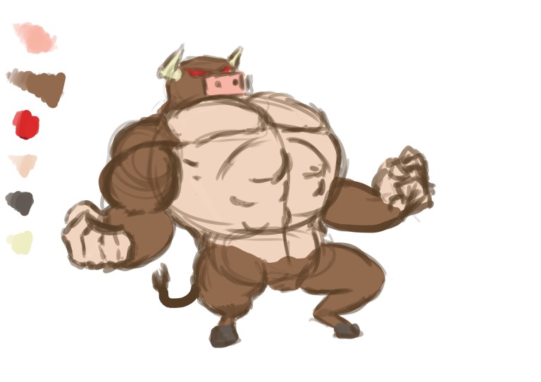
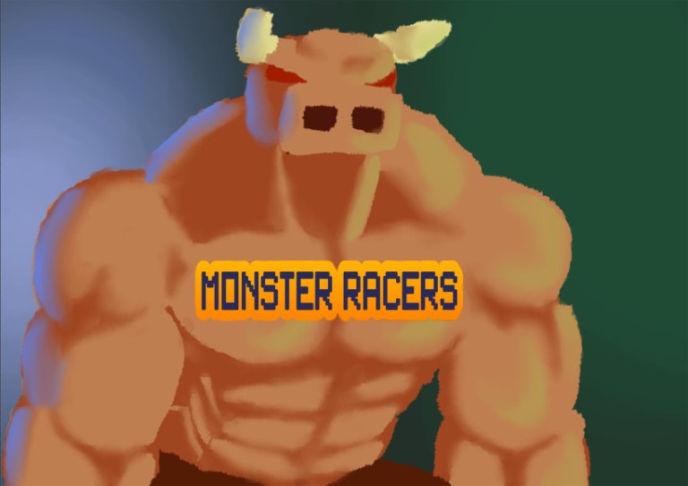
Bottom center: I drew a very cartoonishly proportioned minotaur for a bit of variety as the other sketches are all inspired by things that physically exist.
Bottom right: This drawing is a snake. Again, I could try making the art style more cartoonish. For the dolphin, snake and hummingbird, I could try focusing on a specific feature of each animal and exaggerate it.

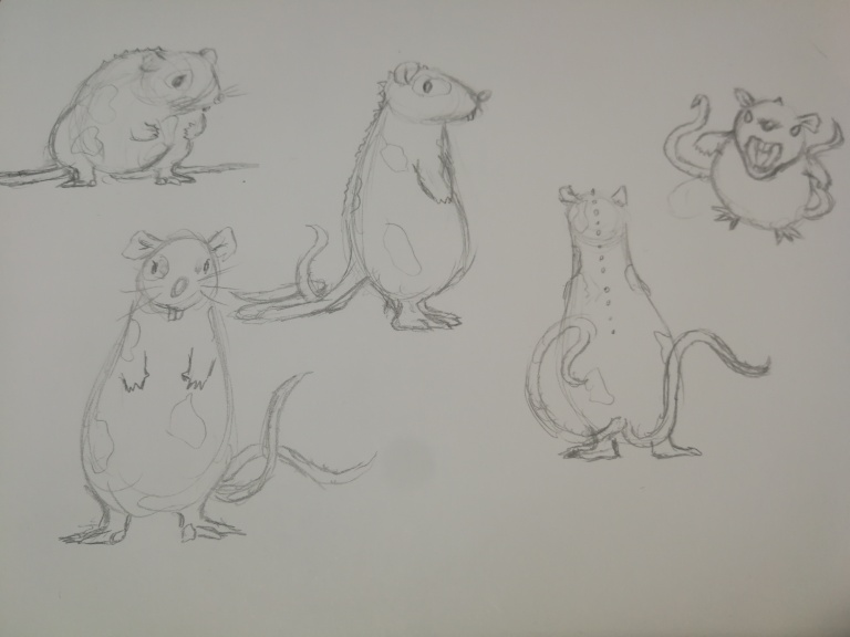
For this design I wanted to try to keep things simple so that children could clearly tell what it is but I did not want it to just be a regular rodent so I added qualities more associated with monsters such as small spikes, multiple tales and strange patches of fur/skin. I also changed some features a regular rat would have for example i changed the shape of the nose, I made the forearms smaller and gave it beadier eyes.
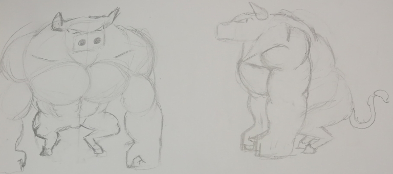
For the minotaur I decided to choose an attribute to accentuate. I chose to focus on the muscles, specifically the top half of the torso like the arms and pectorals and giving him cartoon-like proportions to appeal more to younger children.
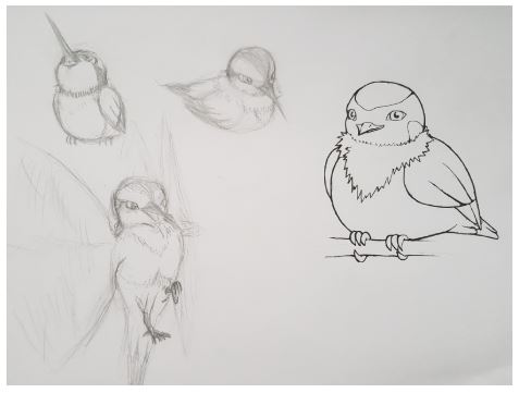
I designed this monster after the real life bird of the humming variety, the sword billed hummingbird to be more precise. Keeping in mind that this is for i game for children i started by drawing a more cartoonish hummingbird. After looking at some pictures of hummingbirds that I had accumulated,
I discovered that some had a small tuft of feathers around their necks and thought I would try adding it to the design. I also thought that as the monster grew and evolved throughout the game its beak could grow longer and tried shortening it considerably which i think looks quite cute despite its semi-creepy human-like eyes.
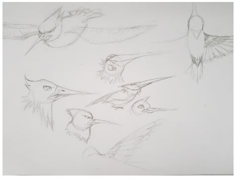
Next i began coming up with ideas for the hummingbird monster’s evolution. I gave it a leaner body type, a longer beak, and bigger wings at first. Then I played with different ideas for the head. I tried making it looked more streamlined and changed the placement of the beak. In the top right sketch I tried making the wings longer reaching from its neck to tail and made them more plane-like.
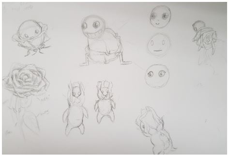
These little friends were inspired by roses. I was not really sure what to do at first so I drew an actual rose. The top left sketch I made the actual flower more of a home for a little round creature that could move around on some small roots. The top middle sketch I flipped the flower upside down gave it a pair of legs and a round head imagining it expelling pollen from the flower to propel itself forward. I didn’t really like the head I drew three others beside it giving them less insect-like eyes and changing the shape of the mouth even completely removing it from the bottom iteration. The three sketches at the bottom of the page focuses more on the thorns of a rose. It has a bud for the head, a cartoonish body shape and five thorns in total; one on each shoulder, one on each elbow and one for its tail.
The main character for the game is supposed to be customisable so I used a less realistic, more plush toy-like style so that body shapes and types would not be a problem. What they are wearing are some ideas of what could be customisable for example their leg wear, tops, jackets, hats, hairstyle and gloves.
Developed Designs
A thunderbird like creature
A more detailed splash art
Designing a monster from the developed designs to animate using photoshop which will be more time consuming but due to the familiarity it has with us and our group does not have flash animate which could have been useful at speeding up the process.
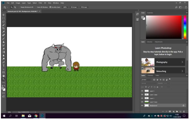
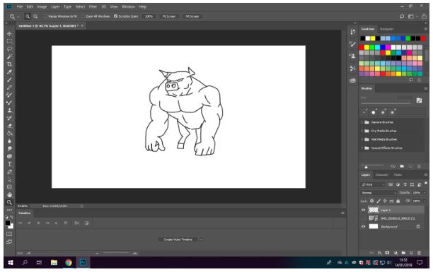
Upon further work, I have added a spike character and a pixelated grass ground, and pixelated sky which gives a retro atmosphere. By making two different layers of the monster to give the impression of breathing.
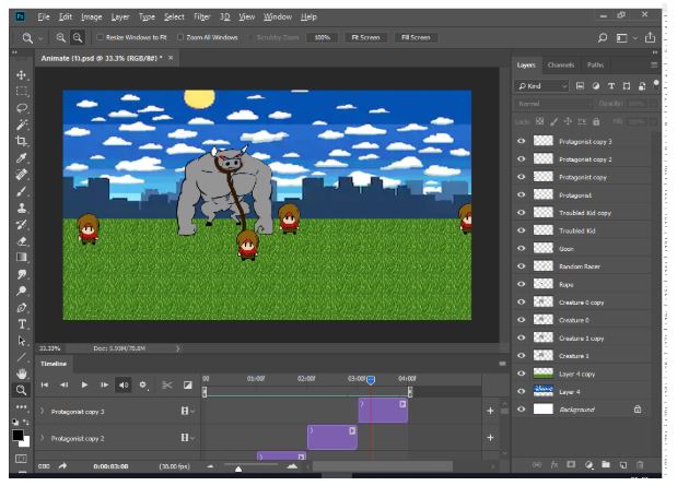
By duplicating the layers and slightly moving and using a timeline window to animate movements frame by frame, although it is time consuming, it gives more detail. I added the details by paint brush and used different layers to organised the frame by frame animation. Though the video will only last seconds. I duplicated layers to imitate movements and place each character.
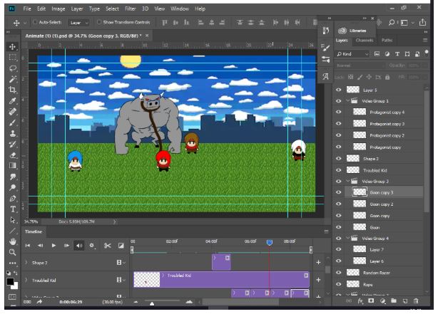
I added expressions on the characters and changed their colors for audiences to be able to differentiate them and identify who is good and evil from the color of their clothes.
Model Development
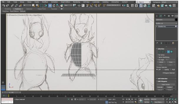
In this image, I used the sphere for the main body of the model. I rescaled Z axis of the sphere to match it to the drawing, I also changed the hemisphere values of the sphere to make the base for the head. I then deleted half the body, so I can make both sides of the model identical later on with the mirror modifier. I learned that I could use the hemisphere values to create flat surfaces on round objects.
I then extruded some of the polygons in alignment with the drawing to make the right arm and leg of the model.
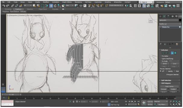
I then made a another sphere for the head of the model. I then changed the hemisphere values to make it easier to attach the head to the body. I then deleted half the head, so I can make both sides of the head identical later on using the mirror modifier. I then used the attach tool on both the head and the body, so they would be identified as one object and I would be able to target weld the vertices of the head and body.
I then extruded and collapsed some of the polygons on the right arm to make the thorns that are in the drawing. I then created a sphere for the right eye and position it where the right eye is in the drawing. I then used the attach tool on the eye and the rest of the model, so they would be identified as one object. I then used the mirror modifier to make both sides of the model identical, but I had to Target weld the center vertices of both sides of the model.
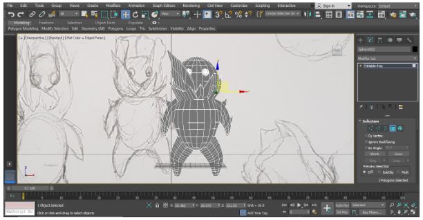
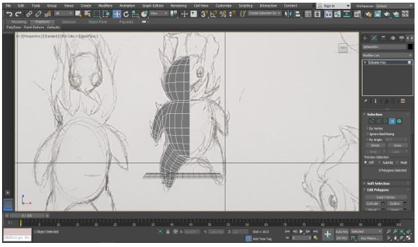
I then extruded the polygons at front of the neck of the model to make the front petals of the model. I found this part of the model difficult to make because I kept losing track of where some of the vertices are, so to deal with this I kept the polygons extruded outwards a small distance away from the face, so I could adjust their size and shapes without getting their vertices mixed up with the vertices of the main body.
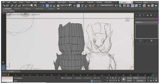
I then extruded the at the back of the neck of the model to make the back petals of the model.
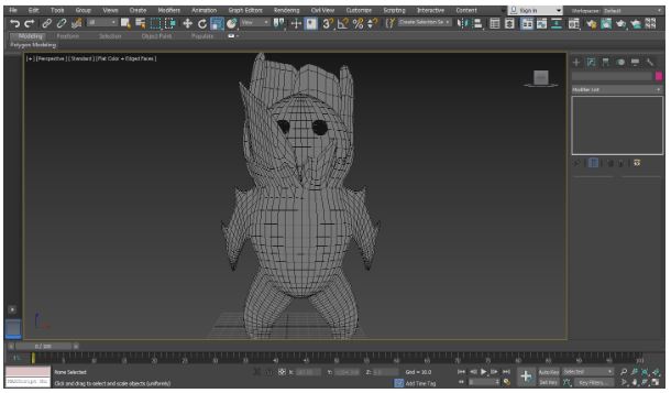
I then used the turbosmooth modifier on the model to make the thorns and petals look more natural.
Controller Layout Development
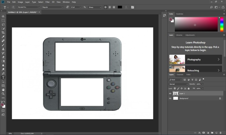
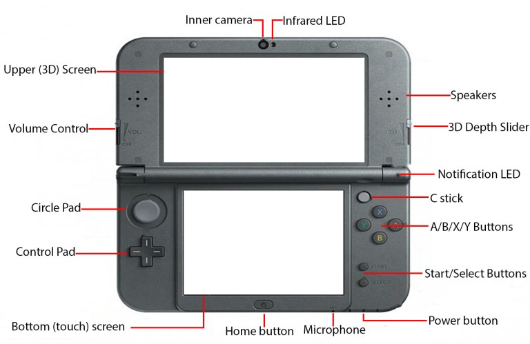
In this image, all I did was find an image of a 3DS and remove all of the parts of the image that have nothing to do with the controller layout.
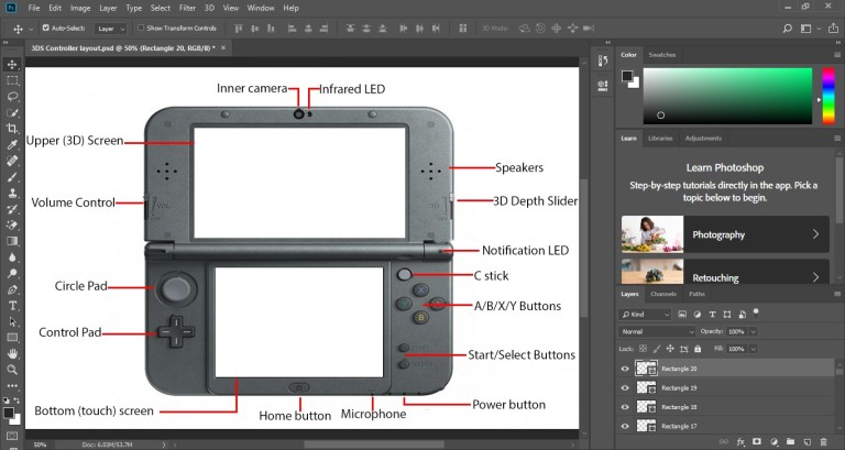
In this image, I labelled all of the features of the 3DS.
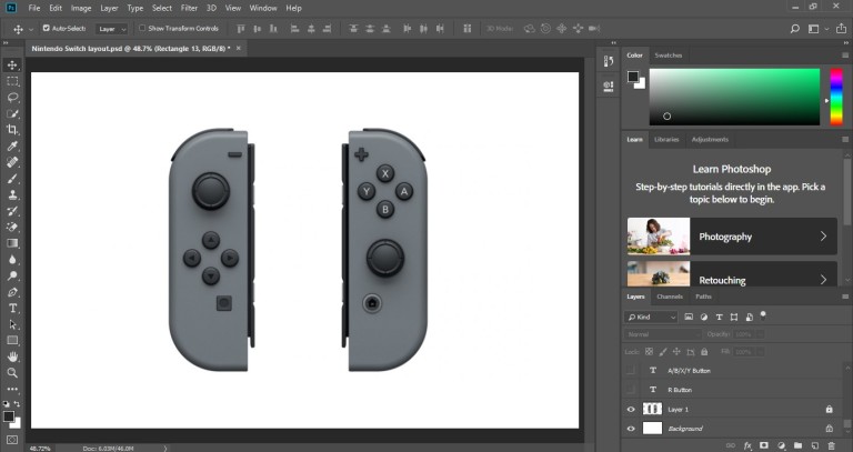
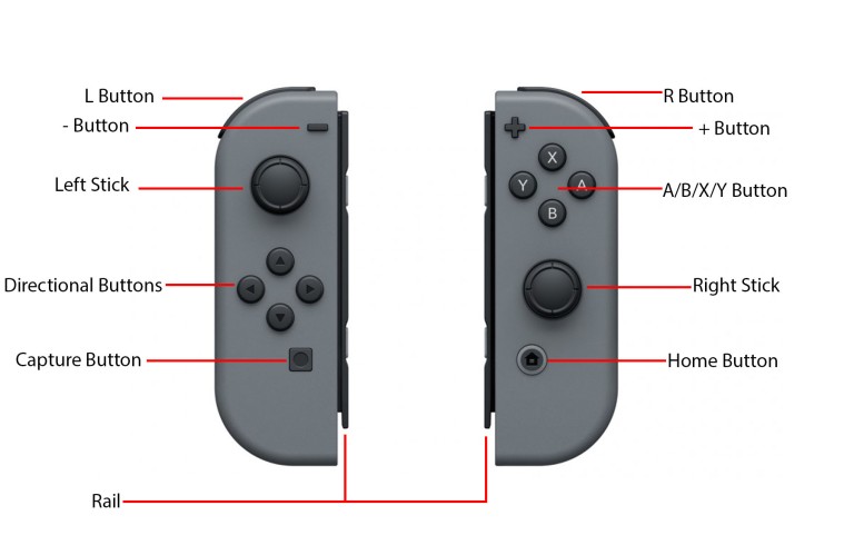
In this image, all I did was find an image of a Nintendo Switch and remove all of the parts of the image that have nothing to do with the controller layout.
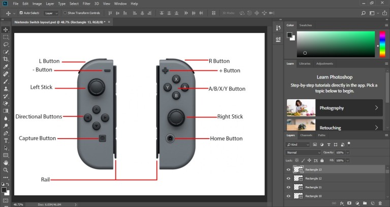
In this image, I labelled all of the features of the Nintendo Switch.
Final Pieces
Concept Art:
Done by Jacob Firmin-Brooks
Splash Art:
Done by Abbie Shepherd
Controller Layout
Title Screen:
End Credit:
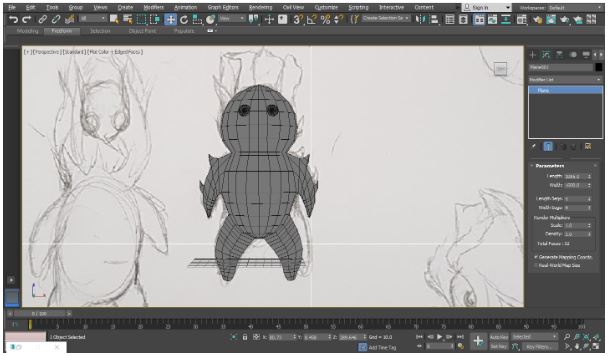
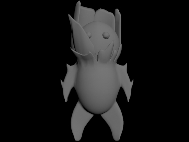
3D Model of a monster (no texture), Pollen Parp
Vertical Slice
Narrative Structure
Todorov Theory Narrative Structure:
Equilibrium: Protagonist wakes up in their room then finds a letter from their mother. Protagonist is told to choose his very own monster
Disruption: Protagonist races with the monster for the very first time and wins.
Recognition of disruption: Protagonist sees a troubled kid attempting to steal a monster from its owner. Which the protagonist then challenges and defeats with ease.
Attempts to repair disruption: The troubled kid then calls for help from an organisation, within a few minutes one of the organisation goons show up to challenge the protagonist but is also beaten.
New Equilibrium: The protagonist then embarked on an adventure to protect the monsters and win the competition to get their mothers approval.
My Evaluation
For this project, I did secondary research about the company mentioned in the brief of this project, which was Nintendo. The research done about this company mainly consisted of the information about the company’s history on how it began, but I don’t think this research was as useful as the other research done by other members of the group because history of how a company started has no relation to the design of an actual game. I believe the source I used for the Nintendo research was reliable because it was an article written by a well-known game writer who specialises in classic video games.
For the contextual research of this project, I did research on the history of retro games., I think this research was useful because the information from this research influenced the themes and designs for the final product. I think this research was biased because some of the games mentioned in the research were games we enjoyed when we were younger.
For the controller layout of our project, I used the basic layout of a 3DS controller and Nintendo switch, since the controls for the game are supposed to simple enough for our target audience to understand.
I modeled one of my groups design ideas, I think modelling the design idea went well because I had very few problems while making the model and the model looks almost identical to the initial drawing, even though there was only one angle I could make the model from. In future will add textures to the model, so it’s individual features would stand out more.
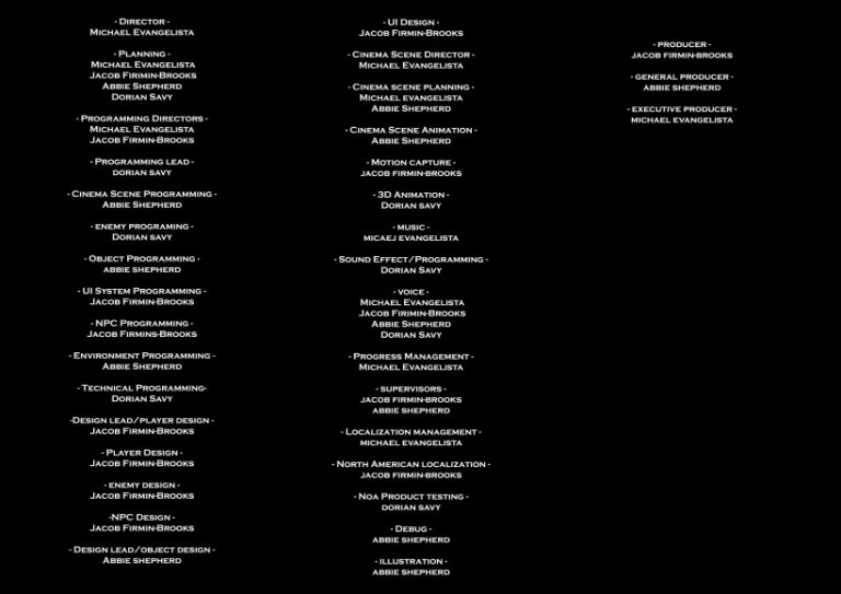
For the credits, I made the background black, so I could make words standout in white. Since there was only for of us in the group, I decided to give everyone roles that was the most related to what they did in the project and all the from mentioned in the credits are from credits in a real game, just so it would easy for me make a credits scene that made sense.
For the title screen, I used concept art made by one of the members of the group as a background for the title screen, which made it easier for me to design the font for the title screen.
In conclusion, I think the group project went well because we were able do research that was relevant to the project and appropriate for the target audience. All the designs for the project fit the theme and were also appropriate for the target audience as well. We were also able to put all our work together for the final piece, which I think came out well, since it’s our first time making something like this. In future, I should do more research, so we would have more influences for our designs.
Michael’s Evaluation
The research consisted of mostly secondary research as it were faster to gain than primary which could be insufficient due to low participants or gathering data would be too time consuming. Secondary research can be unreliable data; it can be reliable from doctors or journalists from newspapers. The data for my secondary research is reliable as my group and I used websites such as psychology today and the guardian, both are reliable sources that give their sources credit. There was a bias towards secondary as it were easier to obtain and compare each sources. The context of the research influenced the work to be similar to retro games like dragon quest and Pokémon. We learned the achievements of retro games and how much impact Nintendo had on the gaming community to be able to create a new culture of gamers whom enjoy the franchises classic games and new games which lead to our design becoming retro and similar to Nintendo games as it has a niche audience that grew into a mainstream audience. I would try to create primary research that could prove my secondary research wrong for a non-biased view on my research. Though it was easy to gain secondary research that were reliable, gaining primary research that were reliable proved to be too time consuming which could be solved by having a targeted audience to gather data from and gather a different targeted audience, see the result and compare it.
The designs we came up with were suitable as it had no violence such as blood splatter or bruises on them, or explicit designs. All were completely child friendly and mostly combinations of creatures and mythical creatures. The colours of the characters and creatures were coloured to show who were evil and good with the protagonist being in white and the antagonists were in black and red. In comparison to my previous work it had improved as there is a lot more sketches to choose from to be the final design. The amount of sketches proved to be difficult to annotate all of them but we managed to annotate all of it. The quality of the initial designs could have been better. I would have expanded more on each of the sketches annotations next time.
The designs were laid out correctly as it followed the storyboards narrative and placed the protagonist on the left side. The arrangement of objects in my animation were lazily done as it only had a pixelated background and characters on the screen which were all aligned to fit into the center of the screen, I used a grid to stay in a wide shot throughout the whole animation. There were no triangles as I used Photoshop and made it a 2D animation.
Our work is appropriate for the targeted audience which met the brief as we had no explicit content or violence within our design or animation. The game is called Monster Racer which has no foul language. It is appropriate for all ages and genders and the work is clearly influenced by the research and initial designs. The context of our project would not make the audience aggressive or agitated.
I chose to use Photoshop as I was familiar with it and knew how to animate in 2D, the quality was low as I had planned as our group was aiming for a retro design. Retro games are mostly in low quality. The presentation of my blog is organised, and showcases how the work came out from initial designs to animation. There is a variety of techniques, from pixelated spike characters to muscled creatures and painted covers. The work were compositioned to be centered and have the audience notice the monsters more than the characters as it was our selling point. Animating was time consuming however it had easier problems to fix than 3D designing because I can easily erase the mistake and redraw it. I would use more programmes to have a plethora of techniques to choose from. The styles were a mix of western cartoons and eastern anime.
Overall, I am happy with the project as the research and designs were sufficient enough and appropriate for the audience. I improved on using Photoshop as I learnt how to do frame by frame animation, and my time was used effectively on focusing on designing and animating each character and added a non-copyrighted audio for a retro game atmosphere. There were no safety concerns as no blades were used or chemicals, however sacrificing sleep to finish work can be dangerous for the individual which I had to, to meet the deadline. My work on this project was similar to my FMP last year due to the 2D aspect but is better as it has more content and audio and was not rushed and had plenty of research that influenced it.
Jacob’s Evaluation
I feel that the designs I created were suitable for the target audience of young children who were the ages three and above. Throughout the design process I made sure that each character was designed in a way that was appropriate for younger audiences but still at least somewhat appealing to and audience older than our target. I feel that my design work has improved during this project, even if it was not by much, as I feel I explored more with some of the ideas compared to my last project however, next time I would like to actually and some colour to more of the designs to develop them further.
For the initial and developed designs, I used pencil and paper as they are easy to work with when creating small sketches for ideas. I then moved to Photoshop to create more finalised work and add colour to one of the monster designs as it is easier to correct mistakes that happen closer to finishing a piece of work. I think that the final quality of most of my work is good except from a digital painting of the minotaur I did as the blending of the colours seems very lazy making the main subject of the piece seem odd. Next time I will take more time on any final piece to make sure they are as good as I can possibly make them and to use a wider variety of artistic media.
In conclusion, I am happy with the project, however, I would like to be more experimental with my ideas and mediums and make the final works more refined and professional. During the project I did not use my time effectively, as I spent too much time on the initial and developed designs which resulted in the final painting being rushed and not as good as it could have been.
Abbie’s Evaluation:
One of the things I chose to research about was extracted from a well-known game, I chose to write about a piece of concept art from the famous Spyro: Reignited Trilogy. I feel like this is a rather good and reliable source to write about as it belongs to a well-known game with the appropriate graphics relating to our chosen type of game. I tried to write about the composition, colours used and other visual analysis but I’m afraid I might’ve not went into as much detail as I needed to.
The second and third piece of research I used were from the very well-known Pokémon franchise, I explained how Pokémon came to be and what the original artist did to help create what it is today. I tried to put in as much relevant information as I could and provide images to back up my points. I chose this for my artist research as our chosen type of game is inspired from Pokémon and it was fascinating to write about how the original artist improved and developed his designs as the franchise blossomed. I learnt more about the artist of Pokémon, and it made me impressed by how he improved and created such creatures.
This research helped mainly due to the gameplay and creatures that are featured in Pokémon games, it helped me to design and think about our game.
I believe both of these sources are reliable as both of them are from very well-known companies with a large history of successful game titles and even consoles.
I tried to keep bias out of my research as much as possible, especially since I’m a big fan of Pokémon and I used to play Spyro. I also think it’ll be quite hard to be bias with research as I tried to look from all perspectives.
while I did a good job on researching, I would have hoped to write more about the pieces and how they are related to our work.
It is hard to say if the designs I came up with were suitable as it really does depend on the consumer. They did not show any content or outfits that are suited for those who are not children however which I believe makes them suitable. I also made them with flashy features that may allure those with a love for fantasy and step out the boundaries of the generic human characters.
Ignoring the fact that I think I’ve improved during the time between doing this assignment and last, I think my quality of writing has increased a little.
Like I said in the first paragraph, I believe I could’ve wrote in more detail and more about the actual pieces.
I think my typing is readable and clear, writing in the basic font that most people can read easily. I am sure there are some silly mistakes that I have missed during proofreading, but I tried to keep it to a minimum.
I wish to improve in writing more for my assignments in the future.
I believe that the way I laid out my sketches were clear and it wasn’t too cluttered together, I tried to include as many details as I could without making the concepts look too cluttered.
My work is fit for my target audience as they are young teenagers/kids, and my work doesn’t include anything that is unsuitable for all ages, so I believe. My work does meet the brief as it is a game concept created for a younger audience with no hint of violence shown in the game.
My language use is formal, but there may have been some informal slip ups here and there, as well as silly grammatical errors.
I tried to communicate my ideas clearly to my audience without ending up droning about irrelevant pieces of information that have nothing to do with my assignment.
My work is age/sex/race appropriate as it includes nothing that could be deemed offensive to any groups of people. I tried to include a diverse cast of characters to help with this.
The context of the project affects my audience by either being too easy or childish for older people, or being too confusing or complicated for younger people. I believe we made the game concept in the middle to try and please both sides.
I chose to work in the simple software, MsPaint, mainly because that’s where I have the most experience in, I also chose to work in traditional as that also seemed like a much easier option.
I think the ending result came out alright, we ended up making a game concept with a pretty solid amount of detail and information surrounding it. I attempted to make my blog seem professional throughout the unit.
I try to include a variety of different characters and designs to show my ‘artistic techniques’ by attempting backgrounds which I have next to no experience in doing as well as character features which I rarely use.
I managed to have enough ideas to have a good amount of work towards this brief, I only wish I had more detail and work that were more focused on the writing and coding side rather than aesthetic and graphics. I hope that my designs and sketches will improve in the future.
I am content with the work we have done as a group for the assignment, we have done alot of research and work dedicated to this brief and I believe we have a lot of reason to feel happy about what we have achieved.
During this assignment, I have learnt how to be creative and such in my background work. I also believe I have used my time effectively as we have finished quite early from the deadline.
This project is different compared to my previous work as it allows a lot more freedom and dependence. It was difficult to choose a topic to do a game on but once we got a basic idea it was pretty easy to work on it.
Compared to professional work, it seems amateur, and for good reason.
Compared to others’ work, I believe we are equal in our efforts and results.
In conclusion, I think I did pretty well with my work relating to this assignment, it was pretty fun to design for this game despite my sketches not being the highest quality at all.
I think we worked well as a team and got good work done.
